


See how we turned a default SharePoint homepage into a modern and stunning landing page.
See SharePoint intranet examples that will cut your research time and help you brainstorm ideas for a new Office 365 intranet.
Chances are, you landed on this page because the SharePoint website examples you’ve seen so far look clunky, out-of-date, or just plain ugly—and you want your site to look just the opposite.
See nine great SharePoint site templates to drive your intranet design in 2025. The templates include the SharePoint start page, HR pages and team sites.
See four brilliant SharePoint communication site examples and templates to inspire you in 2022!
If you’re with me on the fact that SharePoint search should just work like Google, raise your hand. Almost 60% of respondents using SharePoint online and on-prem today say they need a better search. Here are some tips that can help you make your SharePoint search experience better today.
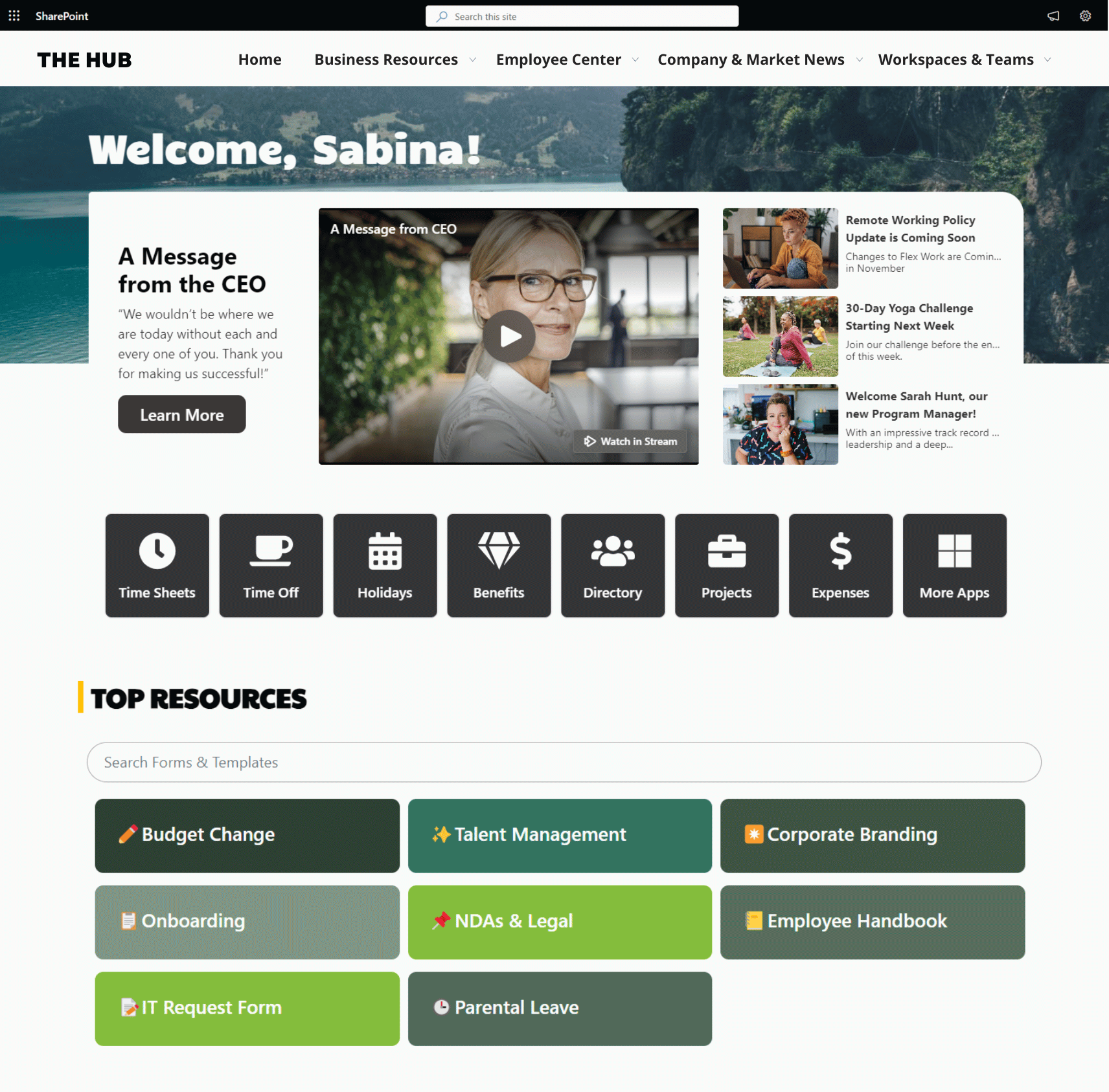
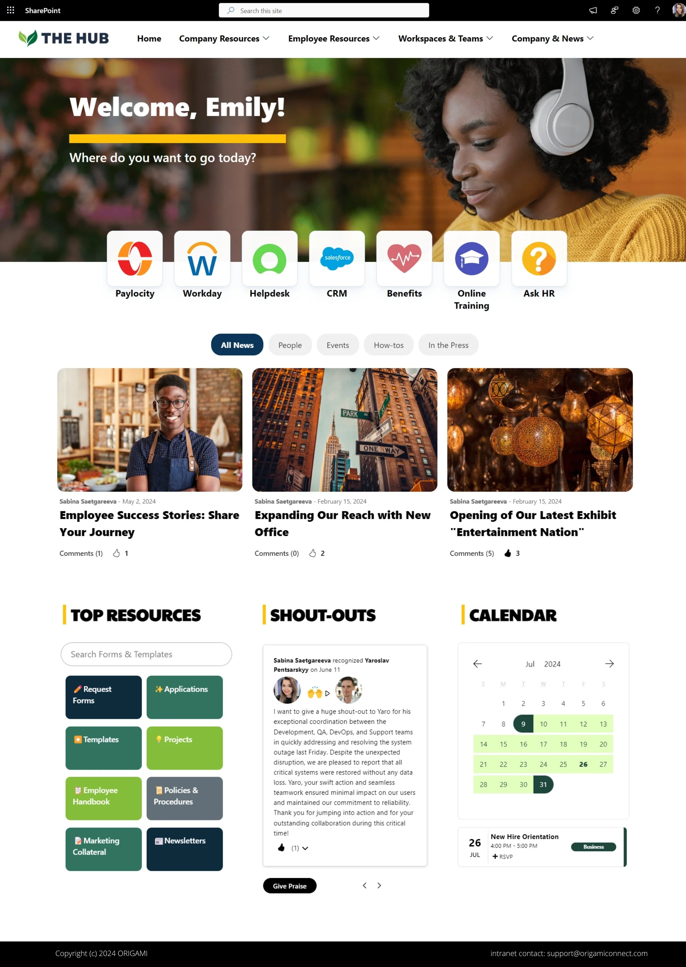
The purpose of the intranet homepage is to provide quick access to what employees need most. This includes: apps and tools employees need most frequently, critical communication, stats and performance at a glance, and easy navigation to get to more resources.
What you’ll see here are the things you can do TODAY to make your homepage POP and create an experience your employees will value.
The most successful HR portals have the tools and resources to cover all three categories of employee needs.
When you organize your HR portal in a way that matches employee needs, essentials first, at the top of the page, available with minimal effort, followed by other needs in order of importance, employees will find your HR portal useful, intuitive.
Let’s get more specific.
Most companies have never done an intranet project—and the lack of process often gets them in trouble. Without a clear process, stakeholders often come to meetings but fail to reach a consensus. They may look at the design and hate it but may not be able to articulate why it’s not working.
Fortunately, a refined process can make everything easier: the visual design, getting constructive feedback from stakeholders, content authoring, and configuration.
Let me first start with this: Creating an intranet that's adopted right from the get-go is not complicated!
But often companies focus on what the intranet should look like, and not on why do we need it in the first place. This has led to too many company intranets going down the wrong path of mediocre user adoption.
Making your company intranet useful and appealing is not complicated. But many companies focus solely on the look of the site and miss the rest.
This has led to companies spending their budgets on a lot of needless activities with little to no change in how employees use it. I feel a need to share my simple but practical guidance on how to make your intranet more appealing and useful.
Being responsible for the design of hundreds of SharePoint Online sites, I hear this question a lot:
Can I use my SharePoint Online site as an extranet?
In this post, I’ll dive into a comparison of what intranet and extranet are. Then I’ll show you some of the most common uses of extranet in different organizations, and what’s the fastest way to get started with your own extranet.
Both Confluence and SharePoint have strengths and weaknesses as an intranet, so I’ll evaluate them based on the following core features any intranet should include based on my experience:
Employee Communication, News & Events
Employee Engagement & Social
Knowledge and Document Management
Search
User Experience
Integration
Security & Permission Management
There’s no denying that SharePoint is the most prevalent intranet platform when it comes to organization and internal communications today. SharePoint and Office 365 intranets are gaining significant ground for the contemporary employee engagement and collaboration features they provide, along with traditional intranet features such as internal communication and information management.
Intranet branding is often confused with the user interface design. Although user interface is part of the brand there are more elements to it such as: intranet logo, intranet name, tone of writing, and design.
In this post we’ll take a look at some of the best practices when it comes to branding your intranet to make it relatable to your organization.
When building a brand new or redesigned intranet, many organizations reuse their public-facing website style guide.
Style guides typically contain:
Logo usage guidelines
Colors
Fonts and typography
Image usage best practices etc
There is nothing wrong with using your public-facing style guide for an intranet, but it’s important not to copy the public website’s look and feel completely.
Here is why:
Often times intranet contains links to your public site. We’ve seen users confused when they click on the link in the intranet and end up on the public site thinking they’re still on the intranet. This is more typical for intranets which have near-identical design as the public site. Try to avoid that.
Another element to consider are the types of devices people will be using when working with the intranet. This will dictate:
Supported screen resolutions. Intranets typically support wider screens to utilize screen real estate for document management
How you present content on the site. Intranet users come to your intranet much more often and content needs to be optimized for quick access.
How do you handle mobile devices. Mobile is less prominent for the intranet and you may save budget with only branding key areas where mobile access is important, as opposed to entire site.
How and what you target as your intranet audience will drive what content should be on it.
Content targeted to employees and staff is different from content you write on the web. The table below illustrates how the audience and technology is quite different between platforms.
Public sites usually have a dedicated team authoring and maintaining the content. Intranet in turn is usually a part-time team of contributors.
|
|
Audience |
Technology |
Capabilities |
|
Public-facing website |
Millennials |
Opensource that’s highly flexible |
Full-time large team, fair budget, fair timeline |
|
Intranet |
Millennials, Gen-X, Baby Boomers |
Intranet solution (ex.: Office 365) that does the heavy lifting, but dictates much of the UI design |
Part-time small team, small budget, short timeline |
Source: Nielsen Norman Group
With that, here are the best practices on what to use from your public facing website style guide, and things to consider:
Don’t overbrand it or make it into an art showcase
Remember who your users are and what they need from an intranet
Don’t deviate from corporate branding to the point of being unrecognizable
Don’t replicate the public site look
It will set unnecessary expectations and confuse others
Keep fonts and colors
Keep page header simple
Majority of real estate will be used for document management; avoid taking up space
The intranet name is another important aspect of branding. In fact, there are many strategies to help you come up with a creative name for your intranet including crowdsourcing with your staff.
Organizations are often afraid that crowdsourcing will produce really bad results and the company will have to either stick with it or come up with a better name. There are strategies you can use to avoid a negative outcome.
It all starts with why you’re rolling out the intranet. Your staff (even if it’s just a handful of decision makers) needs to agree on that. It can’t just serve or be understood by one or two people.
Is your intranet there to:
Help people connect
To help find information
Document management
Employee engagement
All of the above?
Define key goals behind the intranet and come up with the name that suites that goal.
For example, the name “watercooler” sounds like it’s geared towards employee news, events and other employee related topics and not much of a place for corporate information or document management. If that’s your goal for the intranet - then it’s great; if not, you might want to reconsider.
Avoid naming your intranet with generic terms such as:
“SharePoint”
“Intranet”
“Portal”
“[company name] Portal”
Abbreviations
Lengthy names
Hard to pronounce names
NOTE: Intranet URL and intranet name are not one and the same
Your intranet URL can be sharemuch.sharepoint.com due to naming restrictions but have a meaningful name for the site itself which can be used for as an intranet logo.
Intranet logo is best when it’s clear and simple, and includes your intranet name.
Things to consider:
Ensure you maintain square proportions as much as possible
Office 365, for example, uses the logo everywhere on the site and in some places, you can’t control how the system resizes it.
Avoid all white color logo
Again, office 365 out-of-the-box components use this logo everywhere. In some places you may end up with “blank” square if your logo is completely white.
Avoid intranet name + company logo together
The issue is here is that users may be confused which logo they should click on to get “back to home,“ as the logo is often link to the home page.
Another issue is that it increases the length of the logo and Office 365 may squeeze or resize the image, making it look disproportionate or cut off.
The purpose of the footer is to help the user find other important pages on the site and contact information for the intranet team.
It’s become common to have a large footer on the intranet and mimic site top navigation in it. It’s not a bad strategy but there are few things to consider:
Ensure links and information in the footer are up to date
Top navigation usually changes with the site structure automatically, the footer often gets forgotten and links become broken or obsolete.
Avoid social media icons in the footer especially if you have social media feeds on the site - this becomes duplicate information.
Keep number of sections less than 7 (see below; 4 sections already look busy)
Avoid making it flashy, it’s just a footer

Intranet branding goes beyond the colors of the site. It’s about the purpose and serving the content to the right audience. Make it relatable and unique enough from your company public site but not an art project on its own. Remember the resources typically available for maintaining the intranet are less than that for public site and those need to be considered.
Have a comment? Drop us a note!

Yaroslav Pentsarskyy is the Director of Product at Origami. He's also 8 time Microsoft MVP, speaker at many local and worldwide tech events, and a published author of several SharePoint related books.
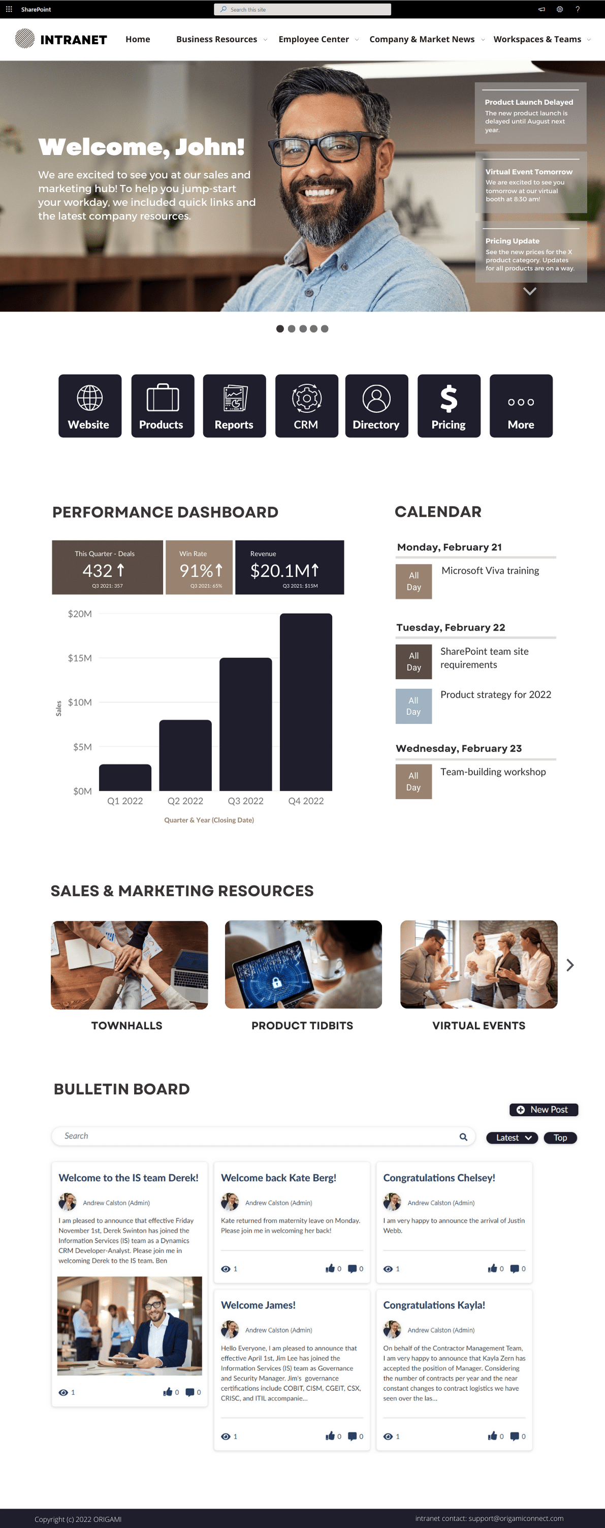
The purpose of the intranet homepage is to provide quick access to what employees need most. This includes: apps and tools employees need most frequently, critical communication, stats and performance at a glance, and easy navigation to get to more resources.
What you’ll see here are the things you can do TODAY to make your homepage POP and create an experience your employees will value.
The most successful HR portals have the tools and resources to cover all three categories of employee needs.
When you organize your HR portal in a way that matches employee needs, essentials first, at the top of the page, available with minimal effort, followed by other needs in order of importance, employees will find your HR portal useful, intuitive.
Let’s get more specific.
Turn your SharePoint into a modern, website-like experience with no code using smart design tips and Origami web parts.
Get inspired with six company intranet examples built on data collected from hundreds of intranet sites. See intranet best practices and design ideas to help you build an intranet employees will love.
We've put together several of our favorite SharePoint site examples all built using Origami to help you come up with some amazing ideas! Learn the essential components for great intranet templates today!
UI design is the most obvious and distinct feature; like the cover of the book, people will judge it first.
The less obvious is how you make it so employees keep coming to your site daily!
Here is how you do it.
Most companies have never done an intranet project—and the lack of process often gets them in trouble. Without a clear process, stakeholders often come to meetings but fail to reach a consensus. They may look at the design and hate it but may not be able to articulate why it’s not working.
Fortunately, a refined process can make everything easier: the visual design, getting constructive feedback from stakeholders, content authoring, and configuration.
Explore SharePoint intranet design templates to provide you with food for thought if you’re thinking of creating a new intranet at your organization. Understand essential intranet design and templates to achieve a successful intranet platform.
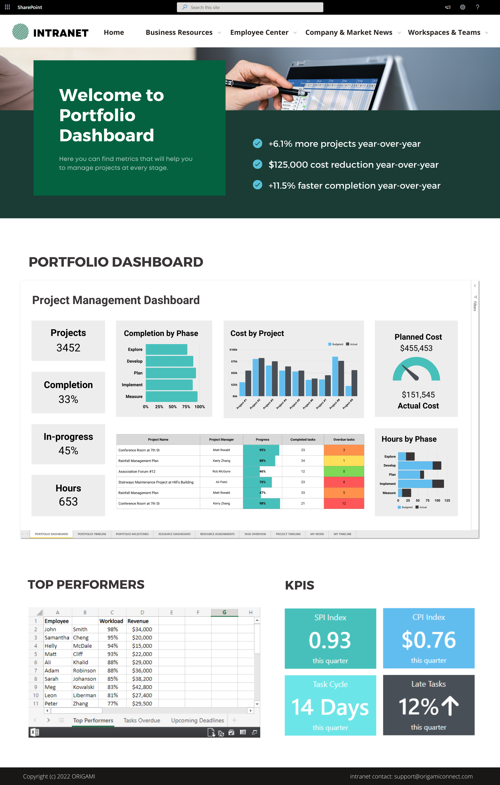
Can you use SharePoint for Project Management? What tools are available to you in Microsoft 365? See examples of SharePoint project sites and dashboards.
A pre-built SharePoint Intranet that feels like it’s been made just for you.


See how we turned a default SharePoint homepage into a modern and stunning landing page.