Chances are, you landed on this page because the SharePoint site examples you’ve seen so far look clunky, out-of-date, or just plain ugly—and you want your site to look just the opposite.
You’re not alone!
If you are looking to make your SharePoint site design stand out, these brand-new design ideas are built on the latest 2025 UX and UI trends to:
Attract employees with modern SharePoint templates
Help employees find things easily
Incorporate employee social
Allow for easy customization and personalization
And be fully compatible, secure, and play by the rules with Microsoft 365
SharePoint Design Ideas
Updated site designs can help your users see the art of the possible, build excitement, and support overall adoption and buy-in.
The following communication site design examples are fully compatible with SharePoint Online and offer insights that can help your site stand out. You might find these examples especially valuable if your goal is to make your SharePoint site look like a website.
This video is a great overview of our latest SharePoint designs!
SharePoint HR Page DESIGN FOR 2025
1.SharePoint design for an intranet homepage
2. SharePoint homepage design for a communication site
SharePoint homepage design for a communication site
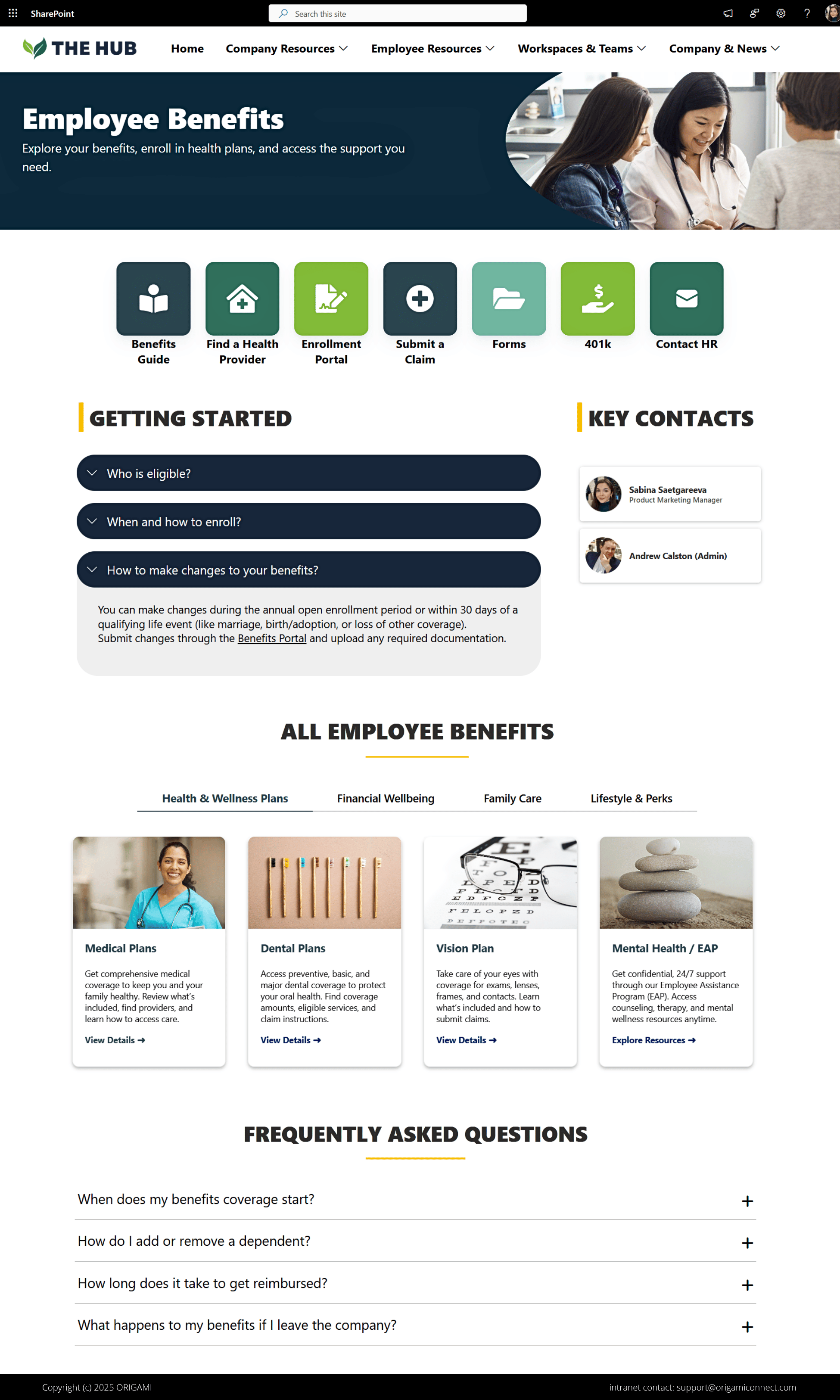
3.Sharepoint Design for HR benefits Page
4. Sharepoint Landing Page for new hire onboarding
5. SharePoint communication site for tech industry
A rapidly growing workforce requires tools to help new employees on board and get to know each other and the company.
Here is an example of the SharePoint website design built with that in mind:
SharePoint homepage design idea
What makes this template great?
- It grabs your attention immediately by engaging the top part of the page.
- All employees get fresh video updates with resources most requested by employees
- Relevant applications are accessible immediately
- Custom corporate colors and a theme keep the design on-brand.
- Feedback form ensures that the homepage evolves with dynamically changing employee needs
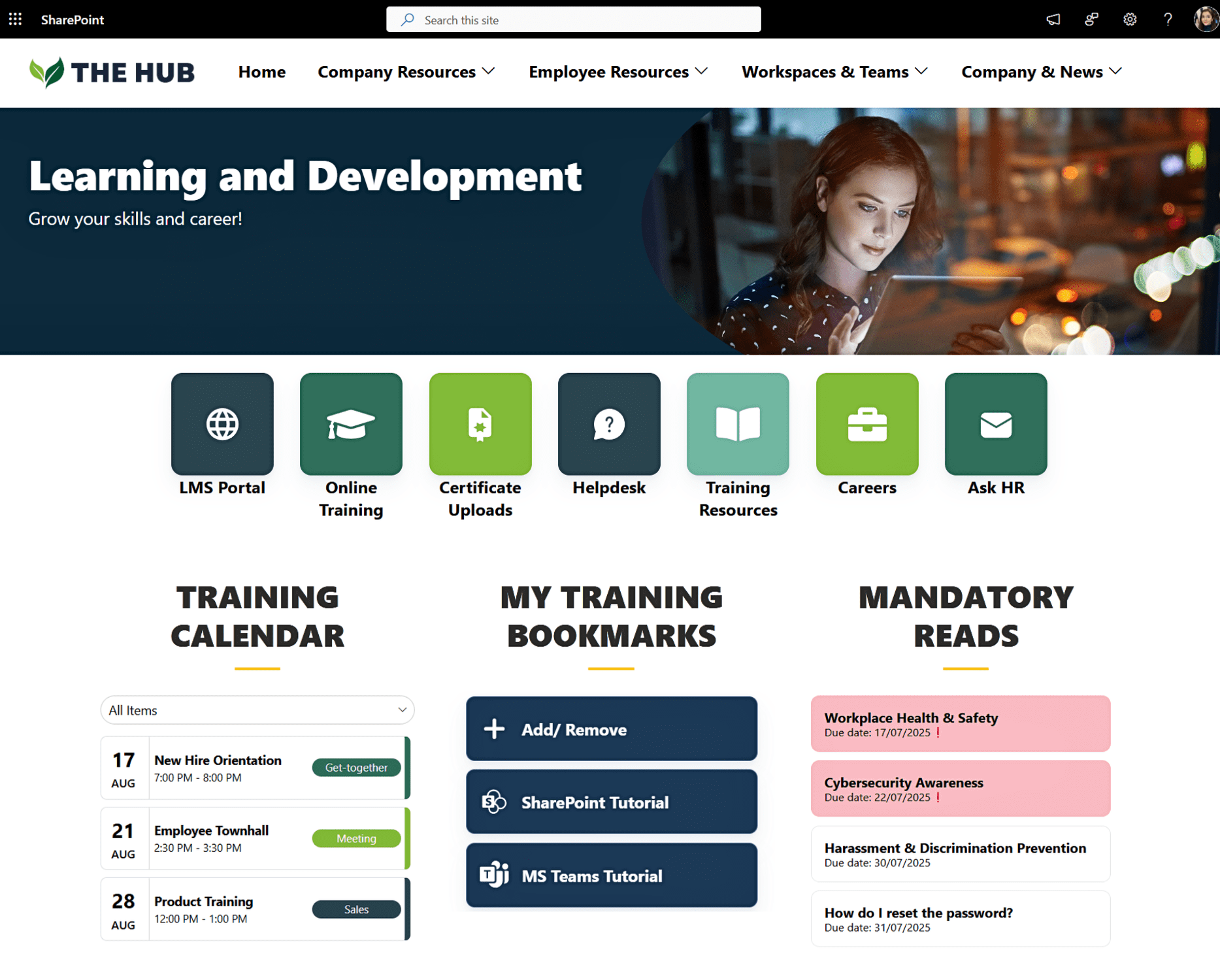
6. Personalized SharePoint TRAINING SITE
SharePoint training site with personalized bookmarks and mandatory reads
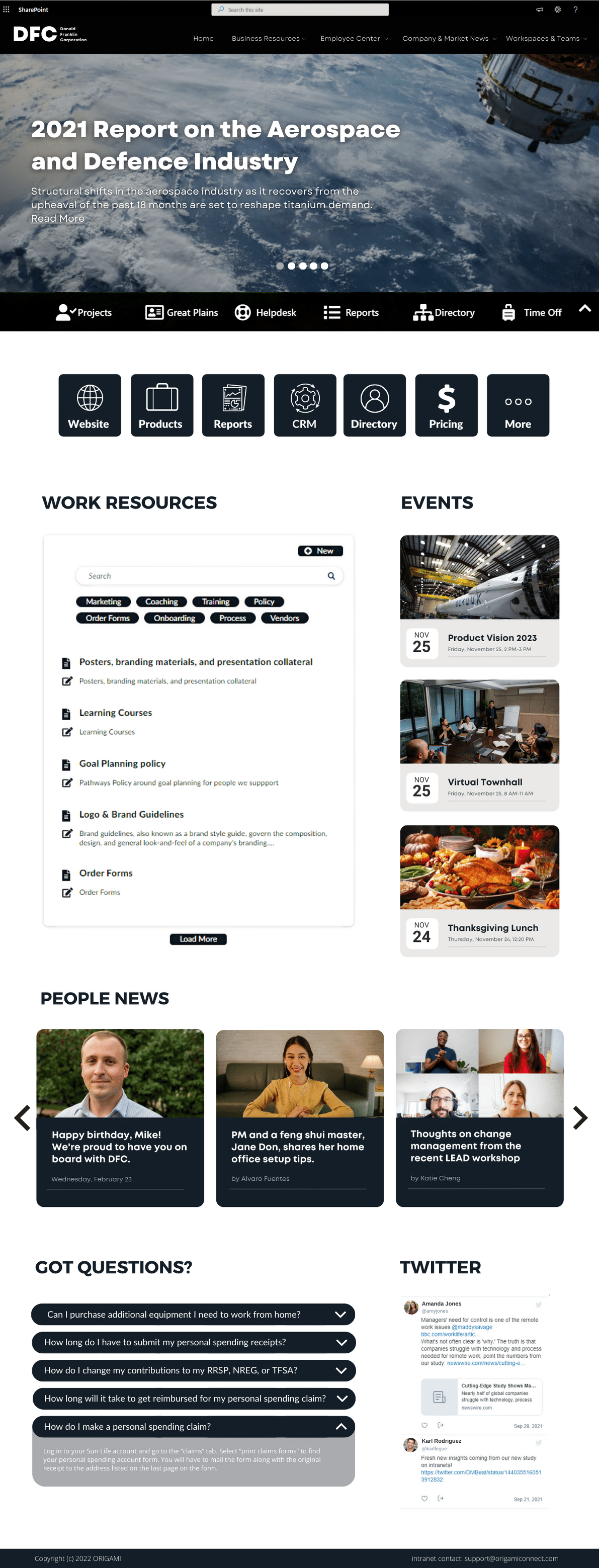
7. SharePoint website design for industrial (including aerospace, defence, biotech)
Large industrial organizations make products that can take years to see and involve thousands of employees, many working on the factory floor. To keep everyone engaged and in the loop, communications should focus on the joint mission and long-term impact while bringing diverse employees together.
Following is an example of a well-done communication site for an industrial organization:
What makes this template great?
- It builds momentum around company impact and mission, including launch of the new product, employee stories, and the company in the news. It often takes industrial products years to launch or show impact, and sharing this with employees helps build morale and excitement about the joint mission.
- An engaging news carousel supports images and video, audience targeting and segmentation.
- The page emphasizes news available in a variety of formats, including multimedia.
- It looks great on large screens and kiosk devices to keep floor employees in the loop.
- Custom corporate colors and a theme are applied in a minimalist and clean layout.
- Employees enjoy easy access to applications and bookmarks as well as employee resources (forms, templates, and FAQ).
- Employee engagement tools help foster engagement and collaboration, including shout-outs for internal engagement and a social feed to update employees on the latest industry news.
Lessons for Best Intranet Adoption Results
The risk of poor user experience can keep managers awake at night because it often threatens intranet adoption and stakeholder buy-in, but a few design adjustments and enhancements can support a better all-around experience.
Modern SharePoint website design and custom look and feel are ranked in the top 3 most important features when building an intranet. Employees at all levels are visual, and sound design:
Leads to easier, faster approval
Builds consensus with other managers (HR, Internal Communication, and IT)
Increases employee engagement and adoption
Reduces costs by focusing on high-value features
To maximize your potential for adoption, pair modern design with the following key lessons:
Don’t present vanilla templates for approval
It’s tempting to open SharePoint (especially SharePoint Online) and use vanilla templates to put together a mockup and show it to users and executives.However, bad first impressions can significantly reduce your ability to properly assess user needs, gain approval, and increase user adoption.
Here is why:
- It takes more time to tweak vanilla templates from SharePoint Lookbook to get the right look. On the other hand, mockups are less expensive to create and update because you have the flexibility to quickly make changes without any development or configuration.
- Users rarely understand the constraints of vanilla. They want to see the art of the possible, whereas a bland design is unlikely to meet their expectations.
Interestingly, even the most elaborate designs are compatible with SharePoint Online.
Watch users interact with designs before building them
You should update your requirements based on what users need, not based on what the vanilla template tries to box you into.We often see templates where the entire page is peppered with the news. Is that what users want to see? During our design workshops, users tell us that news need to be balanced with easy access to work resources and other features.
User feedback can also help you reduce the need for complex intranet integrations that lack value. By watching users interact with a design prototype or a mockup, you might realize that they are indifferent to complex widgets you thought would be valuable.
Gathering this real-world feedback early on can save development and project management costs and reduce technical issues. Useful need not be complicated.
Build a design prototype before the full-scale project
When a design is final, consider building a simple prototype and watch users interact with it. You can learn a lot about the design by observing user interaction.For example, we always test intranet site navigation and search with users because accurate search is one of the biggest concerns and complaints from employees. This simple exercise provides actionable information on how to improve search accuracy for a given customer by as much as 70%. It also saves a lot on rework and provides measurable improvement data to executives.
Design gems for SharePoint intranet
When we present a design, we use data analytics to see how users interact with it, revealing the overall effectiveness of the SharePoint site design and pinpointing any improvements necessary to bolster user satisfaction and adoption.
Here are some of the best tips we’ve uncovered through this process:
Avoid large images that never change, because users will learn to scroll past them and ignore entire sections of your intranet
Provide quick access to tools and resources, such as quick links, at the beginning of the page
Avoid placing too many buttons and calls to action on your intranet, because users find this overwhelming and sometimes miss what they are searching for
Avoid overdesigning interface elements, which can make the content hard to read
Keep accessibility in mind as well as how your design will look on different devices and physical capabilities
What’s next?
If you found the SharePoint intranet templates in this post useful and need help creating one for your company, we’d love to assist you. Our team of experts can create a SharePoint site design that is equally attractive and effective.
Yaroslav Pentsarskyy is a Digital Workplace Advisor at ORIGAMI. Yaroslav has been awarded as Microsoft Most Valuable Professional for 8 years in a row and has authored and published 4 intranet books.
Yaroslav is also a frequent presenter at industry conferences and events, such as the Microsoft SharePoint Conference and Microsoft Ignite.


